
Imagine walking into a supermarket where every product is scattered across the floor, prices are in flashing neon, and constant urgent announcements blare through the speakers. Absolute chaos! Now, picture the same supermarket with clearly categorised aisles, with the most popular products meeting your eye on the shelves, clear pricing, and helpful signage. The difference is night and day.
Visual hierarchy in digital product design is the equivalent of those supermarket aisles. It guides users through your interface, telling them what’s most important, what actions they can take, and how to effortlessly navigate your product. A well-designed hierarchy turns a frustrating jumble of elements into a delightful and intuitive experience. Now let’s explore some practical ways we can establish hierarchy:
- How order impacts visual hierarchy?
- How can we be more intentional with sizing?
- What effect can spacing have on hierarchy?
- Can colour be used to create hierarchy?
- Does depth help visual hierarchy?
- The power of typographic hierarchy
- How not to create hierarchy
How does order impact visual hierarchy?
Where you place elements on a screen has a huge impact on how users perceive them. There are two main patterns that researchers have observed in how users scan interfaces: the “F” pattern and the “Z” pattern.
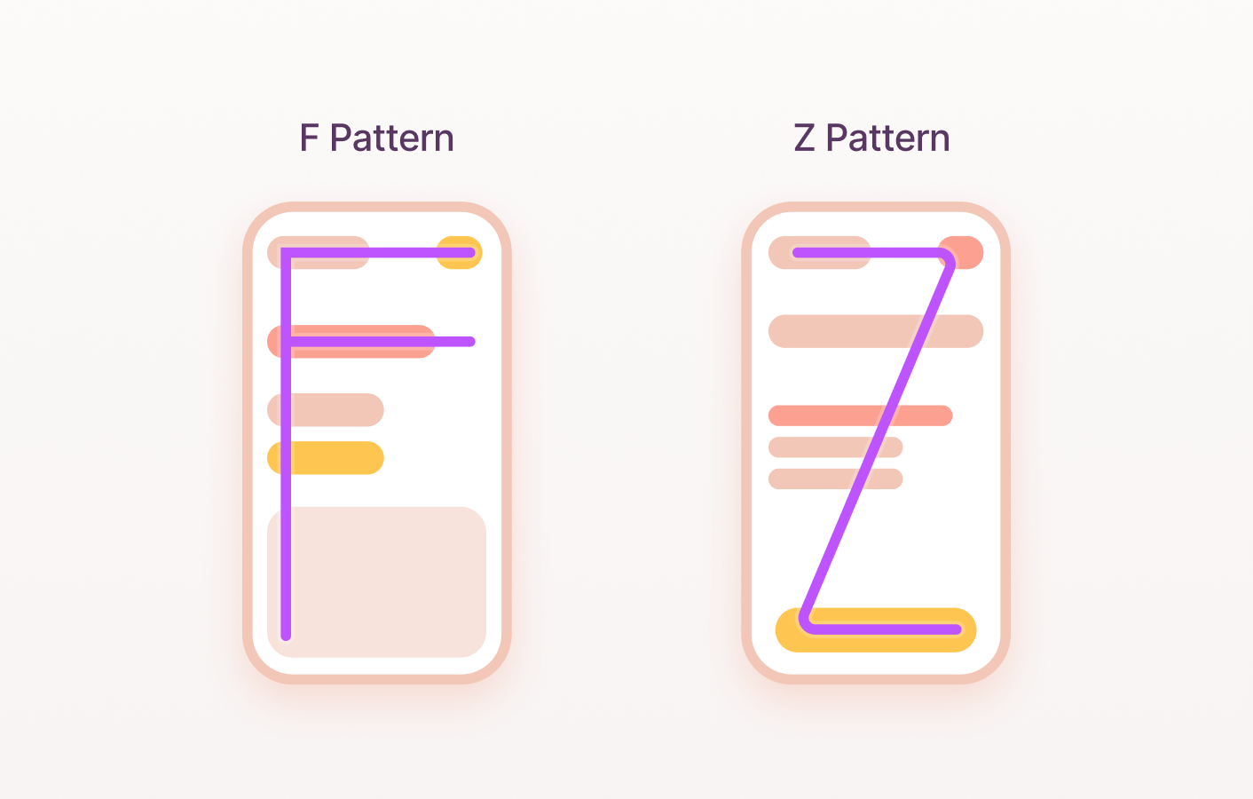
F Pattern
In the “F” pattern, users start at the top left corner of the screen and move their eyes horizontally across the top of the page, then down in a vertical scan in the shape of an F. This means that the most important information and calls to action should be placed in the top left corner and along the top of the page.
Z Pattern
The “Z” pattern is similar, but users tend to scan down the left side of the page in a zig-zag pattern, then across the bottom. Regardless of the exact pattern, it’s clear that users prioritise elements in the top and left areas of the screen. So, critical information and actions belong in those top areas. Less urgent elements can be positioned lower or to the right where the eye naturally rests.
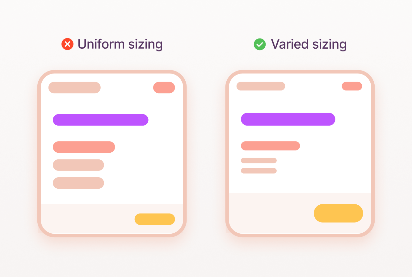
How can we be more intentional with sizing?
Bigger usually means more important. Use size strategically to guide the user’s focus. A large headline immediately communicates the main topic, while smaller supporting text provides additional detail. This creates a visual hierarchy that mimics how we naturally read, scanning headlines first and then diving deeper into the details. Think of a newspaper – the main headline is the biggest and boldest element, followed by subheadings that decrease in size and hierarchy. The same principles apply to user interfaces. Large, prominent elements should be self-contained and understandable at a glance. Smaller elements can provide context and details, but they shouldn’t compete for attention with the main message.
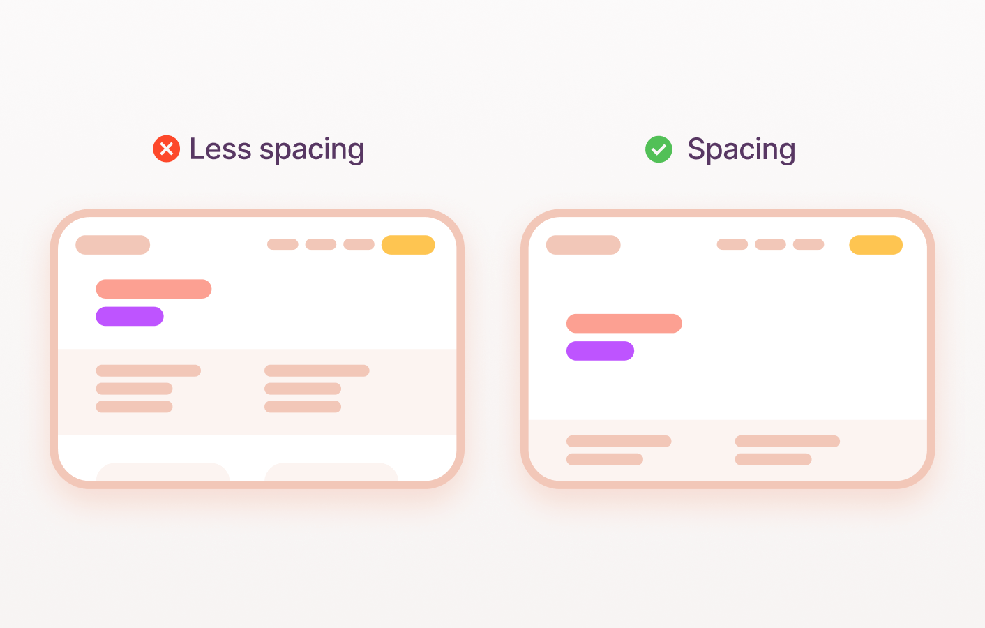
Spacing is underrated
Whitespace (or negative space) is your secret weapon in creating visual hierarchy. It’s the breathing room between elements on your screen. Grouping related elements close together creates a sense of unity and makes them easier to perceive as a group, but space can also be used to portray the importance of an element on the screen.
Take the Mona Lisa, the world’s most famous painting. The Mona Lisa is given ample space around it, separated from other paintings by a considerable distance. This deliberate spacing is not accidental; it serves a specific purpose: to highlight the importance and uniqueness of the artwork.
Just like the Mona Lisa in the Louvre, elements in a user interface can be given prominence by providing ample space around them. This spacing creates a visual hierarchy, guiding the viewer’s attention to the most important piece in the museum. Just as the Mona Lisa benefits from the ample space around it, carefully allocating space in a user interface can elevate the importance of key elements, improve usability, and create a more engaging and visually appealing experience for users.
Learn more about spacing in our article about spacing and sizing.
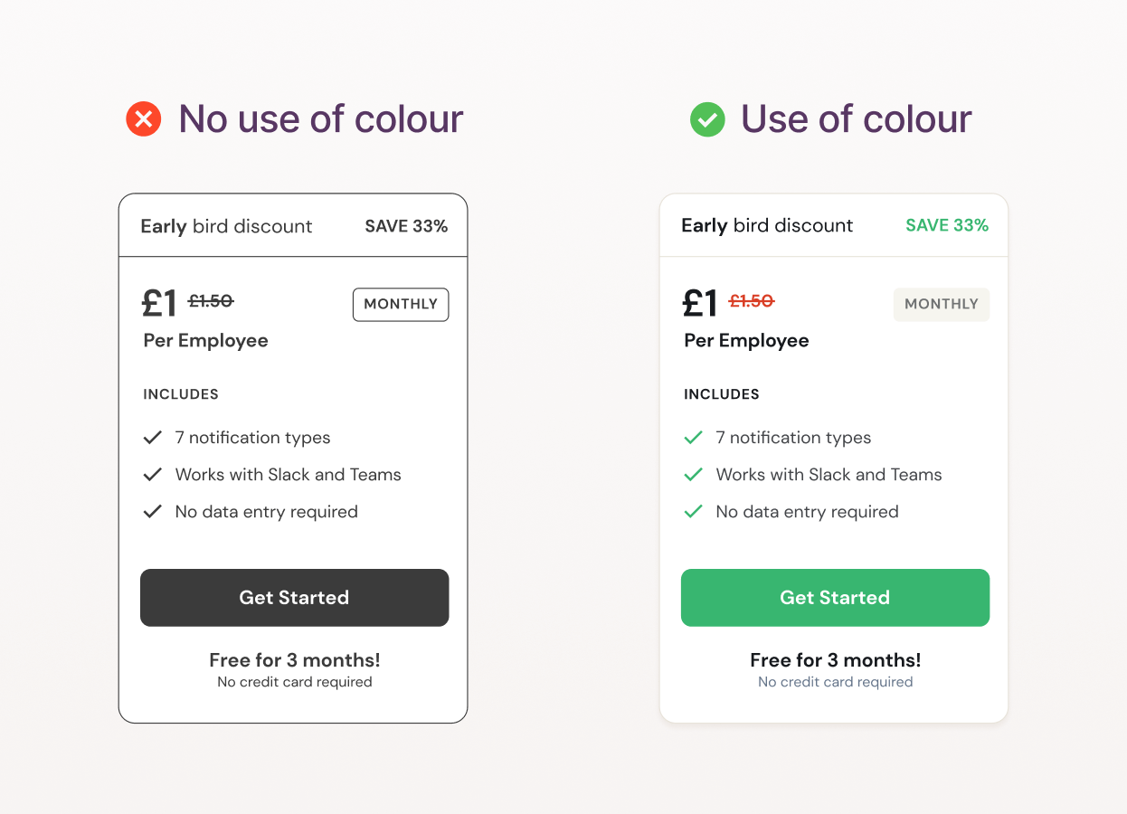
How can we use colour to create hierarchy?
Colour is often seen solely as a tool for branding, but it plays a crucial functional role in user interfaces (UI). Here are two key ways colour creates hierarchy and guides user experience:
Colour contrast
The visual difference between two colours is crucial for readability and emphasis. High-contrast combinations ensure elements are easily distinguishable.
The meaning of colour
Colours have inherent associations. Red often signals urgency or alerts, while green can convey success or positive action. Use these associations strategically to highlight important elements.
Choosing a colour palette that’s both on-brand and creates a purposeful hierarchy is an essential part of the design process.
This visual prompt has been sourced from our work on Relay, building a SaaS platform and marketing website.
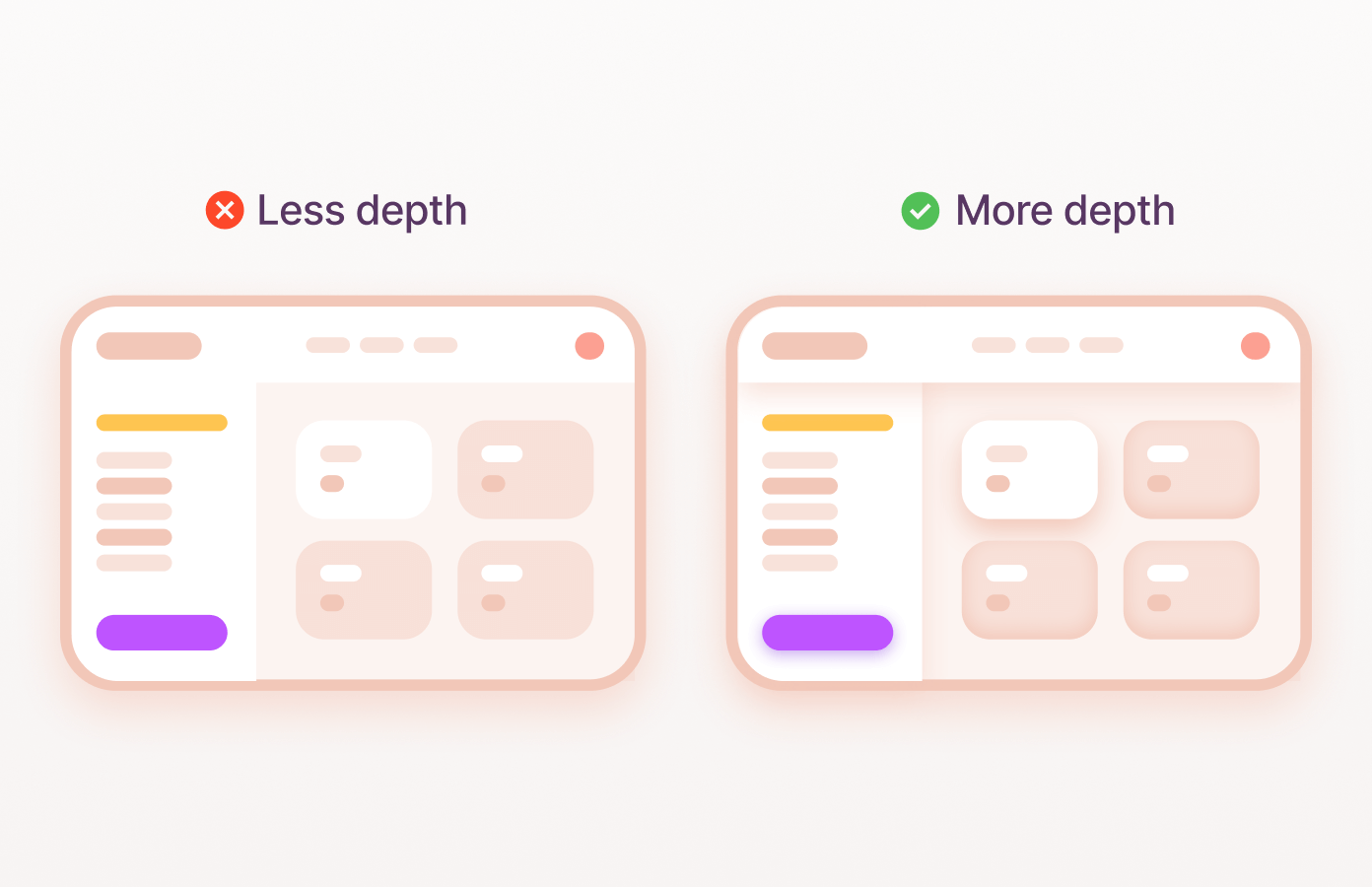
Using depth to create magic subconscious hierarchy
While we’ve already discussed visual order in design, depth adds a whole new dimension – literally! Depth cues, like subtle shadows, borders, and gradients, establish a 3D environment within your interface. They trick the eye into believing that some elements are closer to the user than others. This creates visual hierarchy and emphasis.
For more in-depth guidance on this concept, we really love Googles work on this subject.
The power of typographic hierarchy
Ever struggled through a wall of text? No breaks, no headings – just an endless block of words? It’s a recipe for eye strain and confusion. That’s where typographic hierarchy comes in! It’s the art of organising text to make it easy to read and understand. Think of it as a visual roadmap for your eyes. By using different font sizes, caps, lineheight, weight, letter spacing, and other typographic elements, you can tell the user what information is most important. These modifiers allow you to create anything from a bold, striking hierarchy to a subtle, nuanced approach.
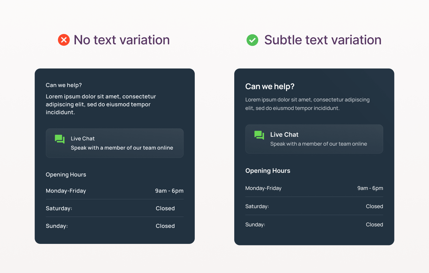
Subtly tuning your products typography
Typography can play a silent but powerful role in shaping how we understand information. Subtle adjustments to how text is presented can have a profound effect on hierarchy and readability. When trying to achieve hierarchy, it’s not about bold, sweeping changes—the beauty lies in the nuance. With a gentle increase in font size, a slight widening of letter spacing, or a touch more breathing room between lines, you guide the reader’s eye and create order. While each individual change might seem almost imperceptible, their combined impact transforms the experience. It’s the difference between text that merely exists and text that effortlessly conveys its message.
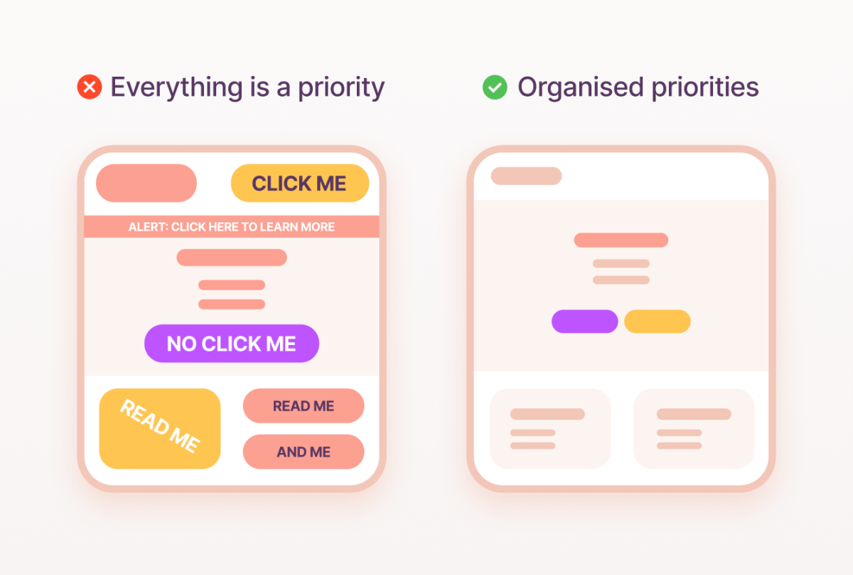
How not to create hierarchy
We’ve covered techniques to establish visual hierarchy within an interface. Now, let’s address a critical mistake that often undermines the best intentions. In organisations with multiple stakeholders – each with their own cherished elements within your design – product owners may try to please everyone by making everything prominent.
This can be a recipe for disaster. Imagine trying to focus on one loud conversation in a room full of people shouting. That’s how a user feels when lots of elements on a screen yell for attention. It’s tempting to make everything big, bold, and red – headlines, buttons, labels – but the result is an overwhelming and chaotic experience. This defeats the purpose of hierarchy. Instead, reserve high-contrast urgency for crucial moments, guiding the user’s eye toward the most important actions. It’s balance.
A classic illustration of this pitfall is the ever-present request to “make the logo larger.” While often a source of humour among designers, the logic behind it is often based on hierarchy. Enlarging elements repeatedly erodes the careful visual hierarchy you’ve established. Remember, hierarchy is about relative emphasis – boosting one thing demotes everything else on the page.
Hierarchy & Brand Expression
As we have already established, visual hierarchy is key for creating a smooth user experience, now let’s look at how we can use this to infuse your brand’s unique identity into the user interface.
What elements within the brand’s identity can I lean on to establish hierarchy?
If your brand is very playful with colour, how can you use colour creatively to functionally assist the user in understanding importance?
How can I create a hierarchy that compliments my existing brand?
For example, if shadows are a key part of your brand, which other ways of establishing hierarchy will complement this?
By thoughtfully considering visual hierarchy, product designers can create interfaces that are both usable and aesthetically pleasing. Visual hierarchy not only makes it easier for users to navigate and interact with a product but also provides an opportunity to express the brand’s unique identity.
Summary
While it might seem like ‘just design’, visual hierarchy makes or breaks user experience. I hope after reading this article you can appreciate how, when done right, visual hierarchy is subtly weaved into elements of your design. Ask yourself:
- What user journeys are most inviting at first glance?
- What will a user look at first in your design?
- Is the interface guiding them or hindering them?
- How are you uniquely creating visual hierarchy in a way that reflects your brand?
By thoughtfully designing with hierarchy in mind, you’ll create digital products that are not only beautiful but exceptionally intuitive.


