Often, lying back in bed after a hard days work at Rareloop, I wonder, what would I do if I could time travel. Amongst an array of, well, much more interesting ideas (mainly involving lottery tickets and altering world events), was the idea to travel back in time and pass myself the core knowledge I have learnt as a UI Designer, with the ambitious goal of shifting into a new timeline and becoming the ultimate designer. Unfortunately for me, and fortunately for you, time machines are yet to be invented, so instead… I wrote this blog.
The Purpose
Whether you are a UI designer, project manager or someone receiving design work, we are all trying to avoid that dreadful feedback that rings through the ears “There’s something not quite right”. This blog aims to drill into some simple practicalities that often lead to this feedback. Born from this inherent problem was the all-encompassing phrase ‘Spacing & Sizing’. After using this phrase every working day for almost 2 years, I have managed to break this broad term down into three main learning points. Each point aims to help you rethink the uses for spacing and sizing.
1. Building Hierarchy
The vital backbone to any user interface is hierarchy. What’s the most important element for the user to see? How do we most effectively make this apparent to the user?
Size matters.
Often, when designing a UI element that needs to portray importance, we tend to increase the size of the element, and this makes sense, in the outside world something large usually gets our attention. However, when it comes to UI, we are limited to screen size, therefore making elements larger means losing precious real estate (screen space).
Size is relative.
As designers, something we rarely take time to think about is size relativity. This all boils down to a simple truth, the size of a UI element is relative to its surrounding objects.
Take a button for instance, if a large button is surrounded by other large buttons, the button will no longer appear large. Whilst a medium sized button surrounded by slightly smaller buttons wastes less space and has more impact.
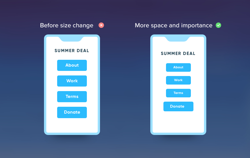
Therefore, it’s important to rethink the way we approach sizing. Be cautious not to waste valuable screen space. Try decreasing the size of other elements in the UI, this is often more effective, freeing up space to further create your importance hierarchy.
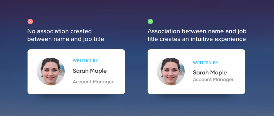
2. Creating Association
In UI Design it’s incredibly important to build association between different elements. Whether you need to group information together or build a pattern for the users to follow.
Uniform spacing is most likely not functional.
As designers, we love to space things out equally, it’s in our nature. However, this rarely serves a valuable purpose to the user, see in the example below how the simple reduction of space turns the piece into functional UI.
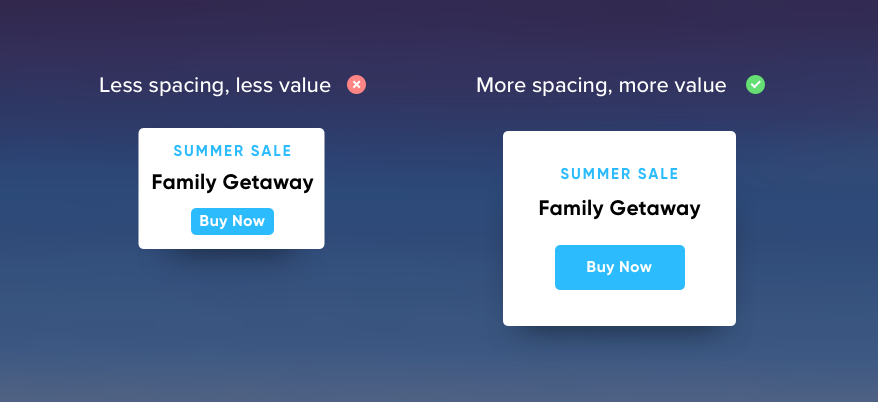
3. Adding Value
To truly understand the concept of value it’s important to step back and ask what value means in the context of UI? Value is alluding to the fact that the UI has something to offer the user, whether it be a button to view a premium package or a strapline at the top of your website that explains your product.
Valuable objects need breathing space.
The Louvre Museum in Paris is home to the most famous painting of our time, the Mona Lisa. Many forget, opposite the Mona Lisa hangs a painting called The Wedding at Cana, which towers over the entire room, 6 meters tall and 9 meters wide, but yet, as soon as you walk into that room you know the Mona Lisa is the main event.
Why? Spacing.
There’s a number of reasons why spacing creates perceived value, the main reason being priority, setting your priorities straight is essential for the user, and if you are willing to burn through valuable screen space around an element the user will sure know the object is worth looking at, and in turn, perceived as valuable.
You’re Done.
Super obvious right? The pointers above are used by most designers without consciously paying attention, but now your attention has been set, try applying these tips, you’d be surprised how many small changes you can make to a design you were previously happy with.