Stable Family Home Trust

A clear, inclusive brand for a people-centred charity.

An accessible visual identity designed to shift perceptions and work consistently across every touchpoint.

A clear, inclusive brand for a people-centred charity.

Background

The Stable Family Home Trust (SFHT) supports adults with learning disabilities through residential and day services that empowers people to live more independent, fulfilling lives.

Despite their important mission, their existing branding wasn’t giving them the visibility, cohesion or clarity they needed.

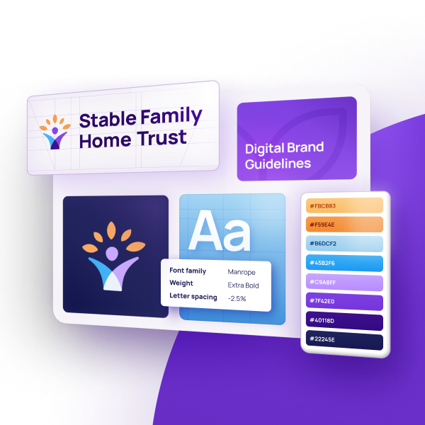
I joined The Stable Family Home Trust as Chief Executive in January 2024 and spent my first three months talking to the staff team to find out from them what they liked about the image of the Trust and what they were less keen on. Not having any branding that truly reflects what the organisation is about came up on numerous occasions. I did not like the existing branding which had been created using some very basic Microsoft images available on the Internet. It was just random shapes and words that had no real connection to what the Trust is about, the colours were harsh, and I was not keen on the abbreviation ‘SFHT’. I had previous experience of working with Rareloop in a different job role many years before and had been very impressed with their work then, so it made sense to me to approach them to work on the rebrand for the Trust.

Jane Smith, CEO

The Challenge

SFHT needed a new visual identity that communicated their purpose clearly and confidently, reflected their values, and could be used consistently by staff and partners.

A key challenge was that people assumed ‘stable’ referred to an equestrian association, rather than focused on supporting adults with learning disabilities. The team wanted the new brand to shift perceptions, highlighting ability, not disability, and capturing their strong connection with the outdoors and commitment to person-centred care.

Their existing visual identity also presented several issues:

  • A visually complex logo that relied on multiple bright colours
  • A logo that lacked professional polish
  • A logo that suffered legibility issues at small sizes
  • No guidelines or rules for how the branding should be applied, making it hard for staff and external agencies to apply reliably.

SFHT wanted a brand that was professional, inclusive and unmistakably them, while meeting accessibility standards and being practical for everyday use.

Our Approach

We began with a Discovery phase to understand SFHT’s goals, audience and personality as an organisation. Through stakeholder interviews, team workshops and sessions with service users, we explored how the charity saw itself, and how others perceived it.

An inclusive, collaborative process was essential. Involving staff and service users throughout ensured the brand felt authentic, empowering and representative of the community it serves.

We also analysed the wider landscape of care and support charities, identifying opportunities for SFHT to stand out with a brand that balanced warmth, credibility and clarity.

The Solution

The final brand identity centred on accessibility, clarity and humanity.

During the creative exploration, we considered a range of concepts around people, home, connection and community. The chosen direction balanced professionalism with warmth and visually expressed both personal growth and a connection with the outdoors.

A new logo

The new logo features a simple, abstract figure with an upward flourish. This form represents people at the heart of the charity’s work, while the upper shapes resemble leaves, symbolising growth, ability and their outdoor-focused ethos. It also gently redirects associations away from the agricultural meaning of ‘stable’ by making the people connection immediate.

Colour palette & typography 

We refined the colour palette based on SFHT’s existing brand colours, but opted for a smaller range including purple, blue and orange, and added a complimentary fourth colour to create harmony. The final selection prioritised both emotional resonance and accessibility, ensuring high-contrast combinations for clarity and legibility across all platforms.

Brand Guidelines

After all elements were approved and refined, we created comprehensive digital brand guidelines covering

  • Logo use
  • Colour specification
  • Accessibility recommendations
  • Tone and application across digital and print
  • Best practises for internal teams and external partners

These guidelines give SFHT the confidence and tools to maintain a consistent identity across every touchpoint, from social media to signage to funder communications.


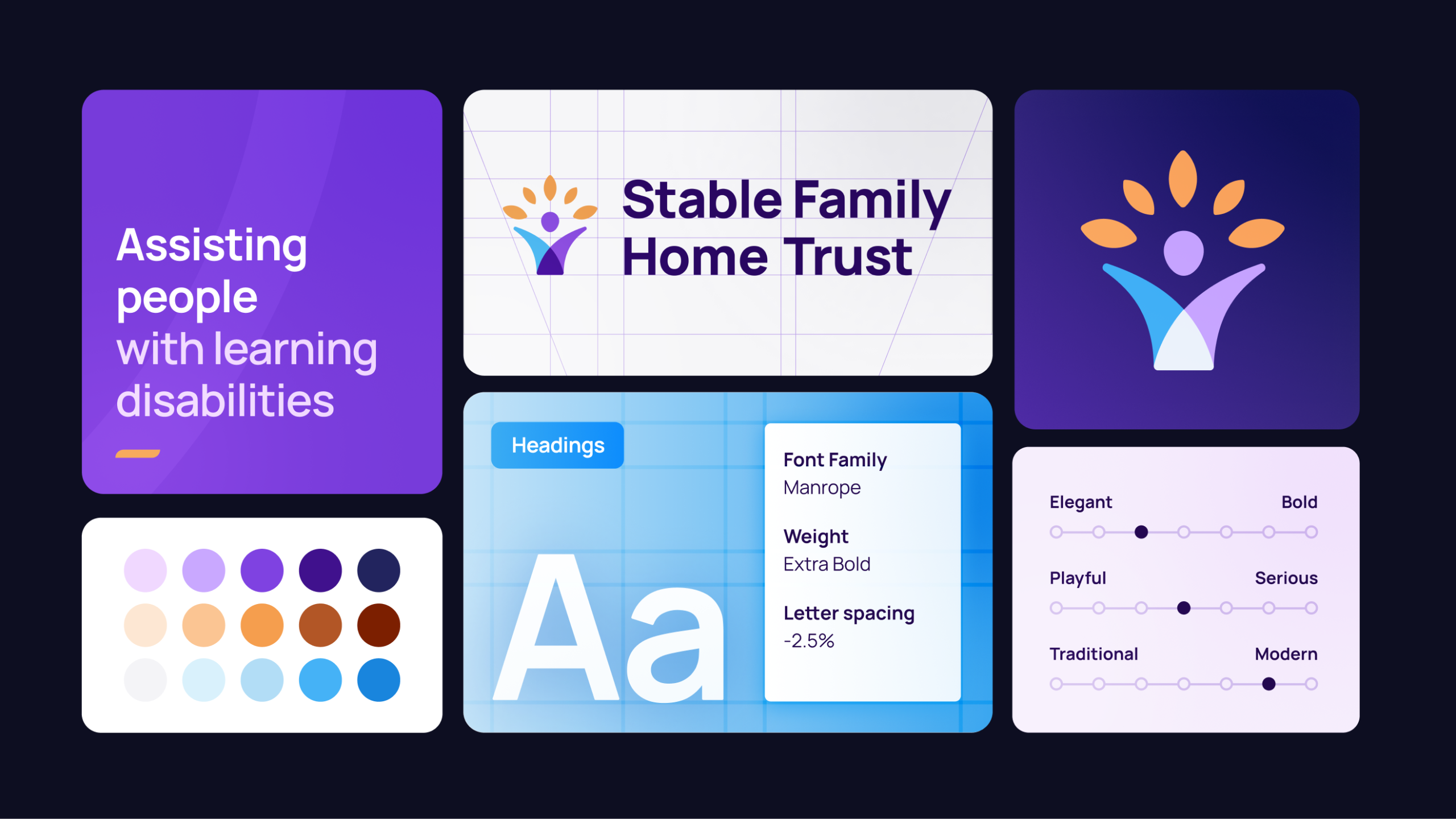
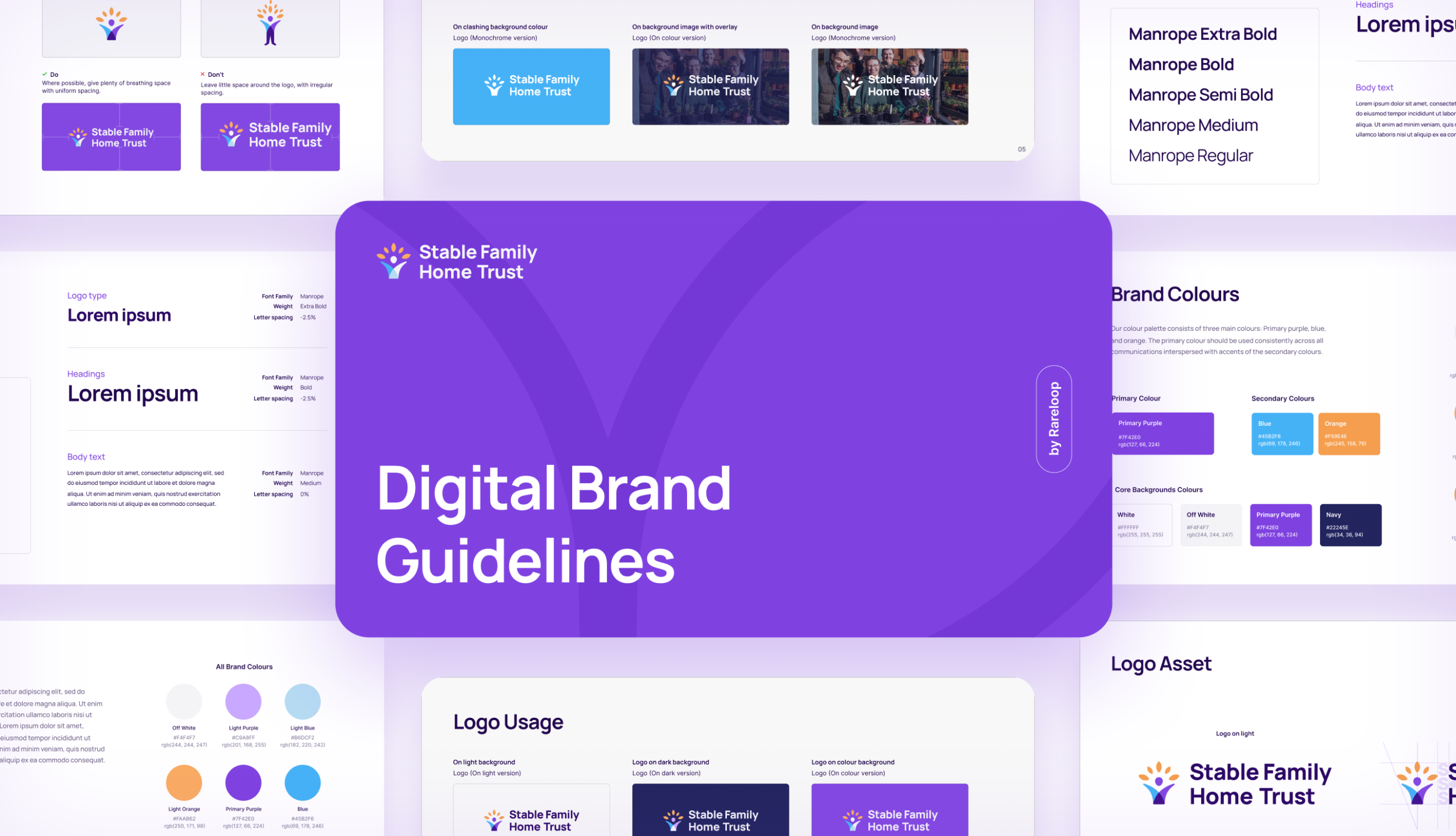
The Rareloop team worked very closely and collaboratively with me and my team and really took the time to fully understand what we were looking for in terms of a logo. We wanted it to reflect that main purpose of the organisation – providing homes, supporting people to flourish and our historical horticultural connections. The Rareloop team developed a clear understanding of the ethos of the Trust and our values from the very beginning and recognised the purpose of the rebrand and the benefits it would bring. The end result has helped give the Trust a modern and recognisable brand that speaks very clearly about our purpose and ethos and has been warmly welcomed by our staff, our service users and their families and also our funders and supporters.

Jane Smith, CEO

The Result

The refreshed brand gives the Stable Family Home Trust a clear, confident and accessible identity that truly reflects who they are. It is:

  • People centred, highlighting ability and individually
  • Modern and professional, suitable for a wide range of communications
  • Consistent and flexible, supporting everything from digital campaigns to on-site signage
  • Something their community is proud of, with staff and service users recognising themselves in the new identity.

The new brand strengthens SFHT’s ability to communicate their impact, build trust and connect with families, supporters and professionals who rely on them.

Let's create something awesome together