As a team we’re a friendly bunch, designers working with developers and developers working with project managers. But when it comes to Mario Kart, things change and it gets a little competitive.
So when our weekly Mario Kart tournaments started getting serious, we knew we needed a better way to track the action. What began as a few spreadsheets quickly evolved into a full-blown custom dashboard, powered by AI, automations and a touch of creative engineering.
Now, our in-house Mario Kart dashboard brings together live stats, rankings, and performance insights. And, because we couldn’t resist taking things a step further, Joe build a ‘Gem’, an AI-powered statical that can answer questions like ‘How many wins do I need to overtake Alice?’.
It’s fun, slightly over the top, and a perfect example of how Rareloop approaches every project: identify a problem, build something clever to solve it, and make it beautifully usable.
The Idea: Turning chaos into clean data
Every lunchtime, the Rareloop office would erupt into a blur of controllers, banana peels, and bragging rights. But when it came to actually tracking who was winning overall, things got messy. Results were buried in Slack, half-filled spreadsheets, and vague recollections of ‘I’m sure I beat you last week’.
We needed a way to bring order to the madness and create a single source of truth for all things Mario Kart. A dashboard that could automatically collect and calculate results, show overall rankings, track trends over time and maybe even predict outcomes.
But, as always, we couldn’t resist pushing it further.
If we were going to build something, why not make it smart? Why not use AI and automation to do the heavy lifting, from collecting data to generating insights, and make it genuinely useful (and entertaining) for the team?
That’s where the Rareloop Mario Kart dashboard was born: part experiment, part playground, and a perfect excuse to flex our technical muscles in data management, automation, and AI integration.
Data in, data out
First we built a structured system for capturing, storing and interpreting the data behind every race. To do this we focused on three main user journeys:
- Time trials. Initially, racers entered a single total time for three laps. Over time we added per-lap splits, kart configurations and pre-built load outs for quicker input. We even scraped world-record data so racers could compare their builds and lap times to global bests.
- Race configuration. Picking who raced and which tracks were chosen used to cause chaos. We used automations to select racers fairly, allow ‘lock-ins’ for those only in the office on certain days, and generate race sets automatically. Players can rate or rank their favourite tracks, and the system balances variety and preferences intelligently, even using AI to create themed sets like ‘water tracks’ or ‘browser’s castle challenges’.
- Race results. Results entry was simplified with a clean UI that showed ‘expected’ placement based on past performance, helping racers see where they over-or-out-performed. Later, we introduced a race kiosk, an iPad beside the TV that made it effortless to log races and view standings.
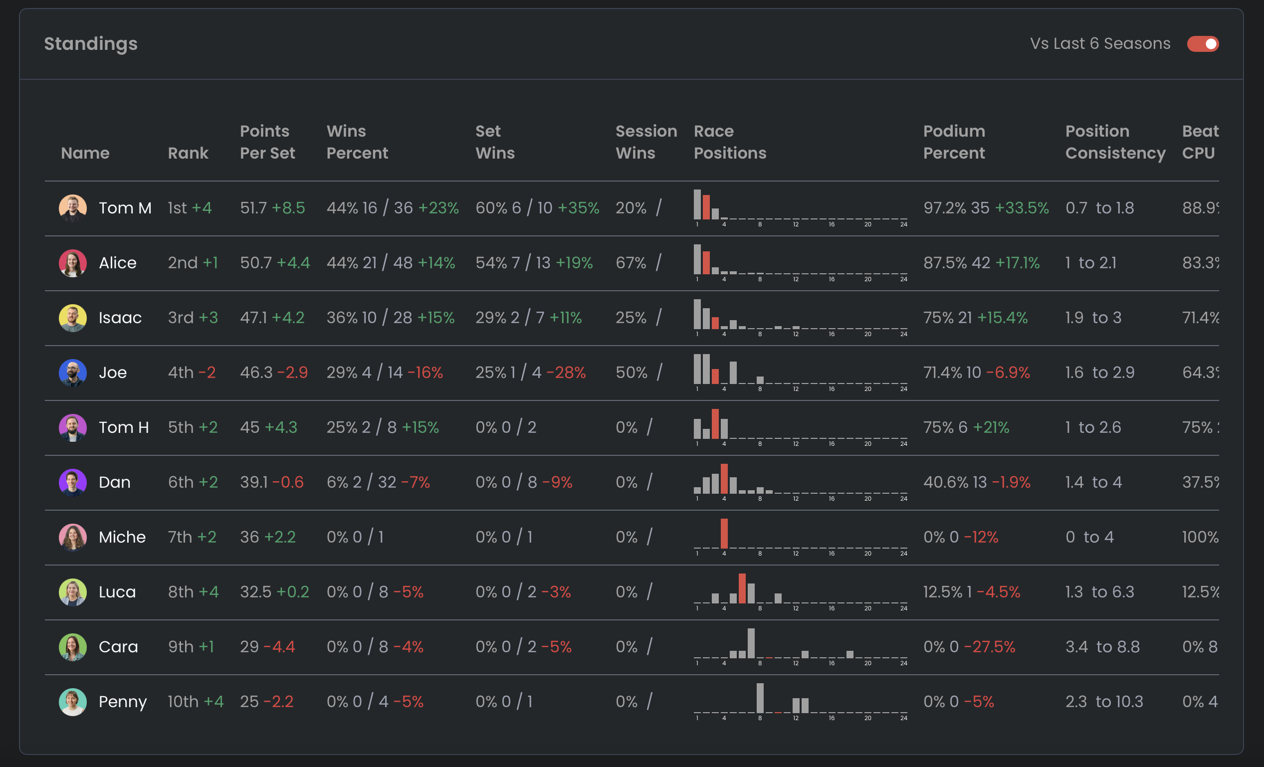
Structuring the data
With a proper database, we defined a hierarchy of racing concepts:
- Race = a single game between 2-4 players
- Race set = a standard group of 4 races
- Race session = several sets run in one sitting (like during lunch)
- Race season = all sessions within a month
This allowed us to track performance at every level, from a single race to an entire season, and establish consistency and fairness across the board.
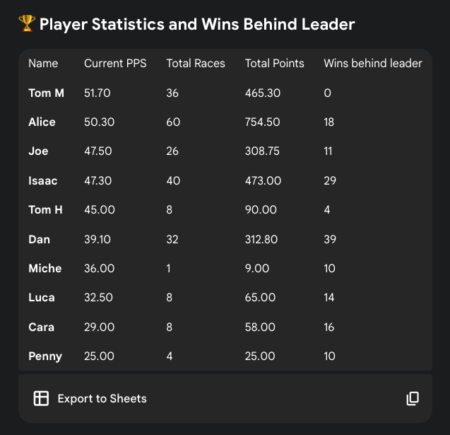
To compare racers who competed different amount, we introduced Points Per Sets (PPS), total points earned divided by race sets played. It’s a simple, fair metric that makes the leaderboard meaningful for everyone, whether you play twice a week or every lunchtime.
Automating the fun
Once the data was structured, automation took over the heavy lifting.
Our system automatically:
- Recalculates leaderboards and win steaks in real time.
- Generates statistics like PPS, consistency and trendlines.
- Sends live notifications to Slack after each race with the results.
And because we can’t resist adding personality, we brought AI into the mix. Initially, post-race messages were simple, ‘Get rekt, Joe wins again!’ but soon we started passing results and track data to ChatGPT, letting it generate dynamic, witty summaries:
“Isaac proved he’s the undisputed king of the tracks, leaving his opponents in the dust with a commanding lead, better luck next time!”
These playful touches made the experience more engaging and showcased how small, well-integrated uses of AI can add delight and context to everyday systems.
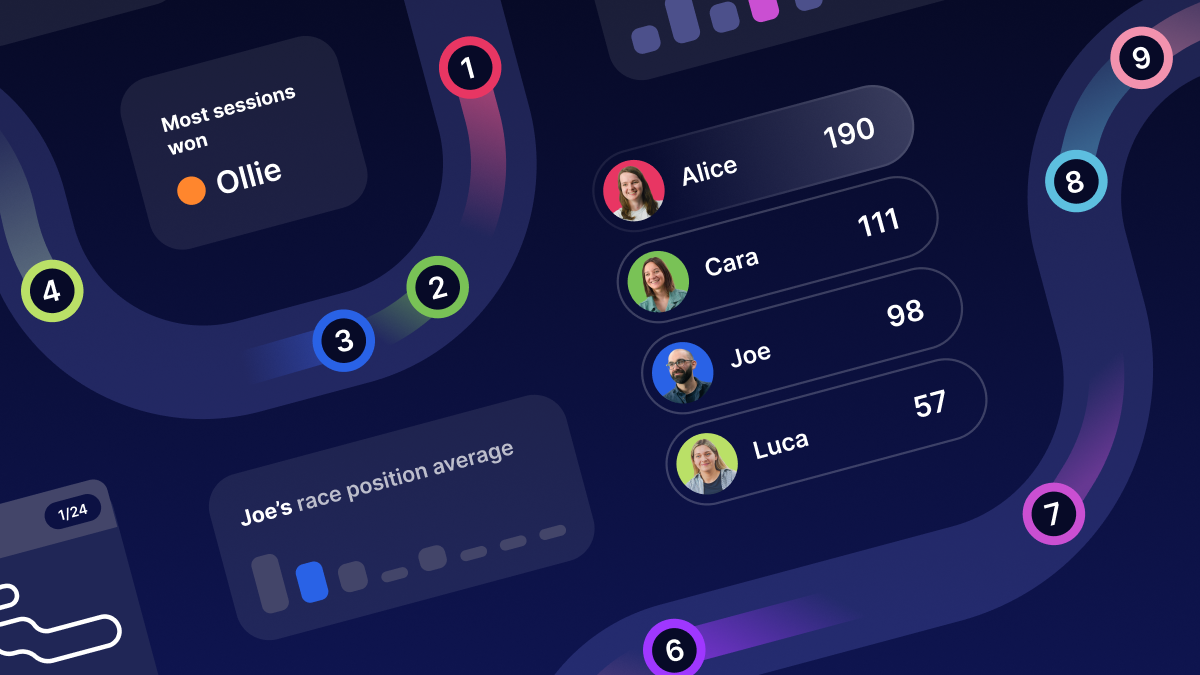
Designed for rivalry, making the data fun to use
Our developers worked to turn data into something visual, interactive, and crucially, fun!
The dashboard features:
- Bar charts to show race positions and PPS trends
- Session and season graphs tracking performance over time
- Player comparisons highlighting head-to-head stats
- Histograms visualising consistency across races.
At the heart of it all sits the Race Kiosk, a tablet-based dashboard beside the racing TV. It:
- Lets players log results instantly
- Displays live standings and race histories
- Suggests the next track in sequence
- Show each racer’s average performance on upcoming tracks.
Meet the Gem, our AI-powered race statistician
The most recent addition to our Mario Kart system, is a ‘gem’ build on Google’s Gemini platform. The Gem acts as our in-house AI analyst, connected directly to the dashboard database, it can answer natural language questions like:
- Who’s on the longest win streak?
- What’s my average finish on Rainbow Road?
- How many wins do I need to overtake Joe?
It’s an experiment in making complex data more accessible, a fun prototype that hints at how conversational AI can power the dashboards and analytics tools of the future.
What is shows about how we work
The Mario Kart dashboard started as a side project, but it’s become a great showcase of how we approach every build at Rareloop. The same principles that made it successful, clear data structures, automation, thoughtful design and playful AI integration, are what underpin the bespoke systems and dashboards we create for clients.
We follow the same process each time:
- Identify the need
- Design and prototype quickly
- Automate intelligently
- Test, refine and iterate
Having an internal playground like this is invaluable as it gives us space to experiment with new technology and explore ideas before bringing them into client projects. The dashboard has been a proving ground for many of the features, techniques, and infrastructure that now power production systems.
Whether we’re helping a client manage operational data, visualise performance, or streamline internal workflows, our goal is the same: make complex information simple, actionable, and enjoyable to use.